There’s a very painful moment almost every developer experiences at some point.
Your website looks beautiful.
Animations smooth.
UI modern.
Features working.
Content uploaded.
You feel proud finally.
Then someone opens the site on mobile internet…
…and it loads like it’s stuck in 2016.
That moment hurts differently.
I still remember checking my website speed scores seriously for the first time and honestly feeling slightly embarrassed.
Because in my head, the website felt “fast enough.”
Reality?
- huge image sizes
- terrible mobile performance
- layout shifts everywhere
- blocking scripts
- slow fonts
- poor Core Web Vitals
And the worst part?
I didn’t even realize how bad the experience was until I started testing on slower devices and networks.
That experience changed how I think about web development completely.
Because speed is not just technical optimization.
Speed is user experience.
Speed is SEO.
Speed is trust.
Speed affects everything.
A slow website silently kills:
- traffic
- rankings
- retention
- conversions
- engagement
And honestly… beginners often underestimate this badly because during development we usually test on:
- fast laptops
- strong WiFi
- powerful browsers
Real users don’t always have that luxury.
This article is basically everything I wish someone had explained earlier about website speed optimization and Core Web Vitals — not robotic SEO checklists, not generic “compress images” advice.
Real developer lessons.
Real frustrations.
Real debugging pain.
Real workflow improvements.
Because website optimization is one of those skills that feels invisible initially but becomes incredibly valuable later.
Especially when your traffic starts growing.
Why Website Speed Matters More Than Most Developers Think
One thing I realized slowly is this:
Users do not consciously “analyze” website speed.
They feel it emotionally.
Slow websites create friction instantly.
People may not say:
“This website has poor Largest Contentful Paint metrics.”
They just leave.
That’s the real problem.
And honestly, internet users became extremely impatient now.
If pages feel slow:
- bounce rates increase
- engagement drops
- trust decreases
Even a few seconds matter.
I noticed this myself while browsing websites.
Fast websites feel modern and reliable.
Slow websites feel broken, even if visually attractive.
That psychological effect matters massively.
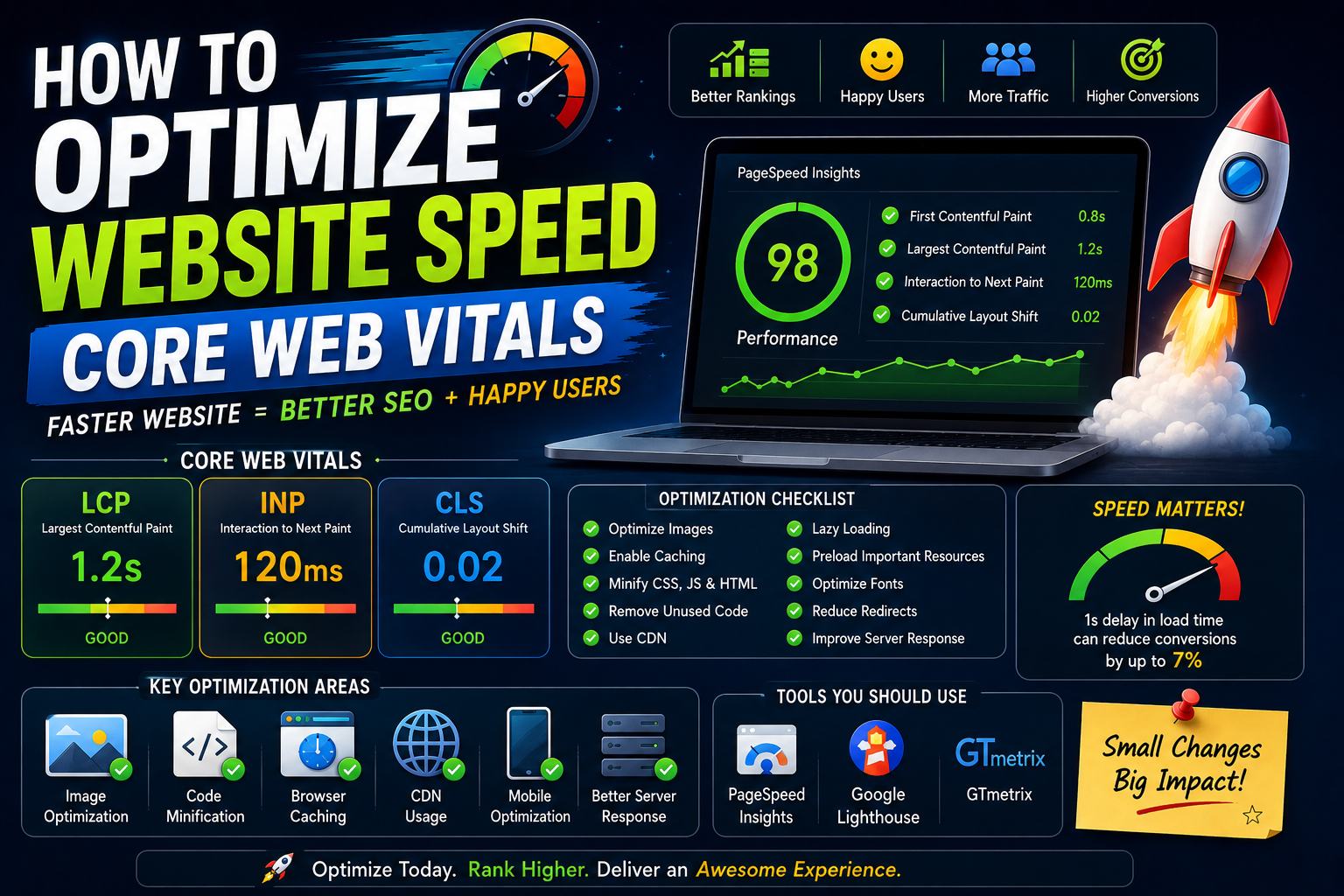
What Core Web Vitals Actually Mean
When beginners hear “Core Web Vitals,” it sounds complicated and scary.
I thought the same initially.
But honestly, the concepts are simpler than they sound.
Core Web Vitals are basically Google’s way of measuring real user experience.
Main metrics include:
- Largest Contentful Paint (LCP)
- First Input Delay (FID) / Interaction to Next Paint (INP)
- Cumulative Layout Shift (CLS)
Initially these names confused me badly.
Now I think of them much more practically.
Largest Contentful Paint (LCP)
Simple meaning:
“How fast does the main content appear?”
If users wait too long to see meaningful content, the website feels slow.
This usually depends on:
- images
- server speed
- render blocking resources
Interaction to Next Paint (INP)
This measures responsiveness.
Example:
User clicks button.
How quickly does website react?
Laggy interactions create frustration immediately.
Especially on mobile devices.
Cumulative Layout Shift (CLS)
This one annoyed me personally for a long time.
Ever clicked something and page suddenly shifts?
That’s CLS problem.
Usually caused by:
- images without dimensions
- ads loading late
- dynamic content injection
Very frustrating user experience.
My Experience: The Day Performance Became Serious
For a long time I ignored optimization honestly.
Not intentionally.
I just thought:
“I’ll optimize later.”
Classic developer mistake.
Then one day I started checking:
- PageSpeed Insights
- Lighthouse
- Core Web Vitals reports
And suddenly reality appeared.
Mobile performance was terrible.
Desktop looked okay.
Mobile was struggling badly.
That realization changed everything because most real-world users access websites from phones.
Especially in countries where:
- internet varies
- budget devices are common
Optimizing for powerful laptops only is unrealistic.
That lesson hit me hard.
The Biggest Beginner Mistake
Most beginners optimize visually before optimizing technically.
We focus heavily on:
- animations
- fancy UI
- effects
Meanwhile:
- bundle size explodes
- scripts increase
- images stay uncompressed
And slowly website becomes heavy.
I made this mistake repeatedly.
Especially while experimenting with modern frontend frameworks.
Why Modern Websites Become Slow So Easily
This part honestly surprised me.
Modern web development tools are powerful.
But they also create hidden performance problems.
Examples:
- large JavaScript bundles
- unnecessary libraries
- oversized images
- too many third-party scripts
- excessive animations
Developers often install huge packages for tiny features.
I’ve done this too.
One npm package here.
Another there.
Suddenly website ships megabytes of unnecessary code.
Users pay the price.
Biggest Mistakes I Made
Uploading Huge Images
This mistake alone destroyed performance repeatedly.
I used to upload:
- full-resolution screenshots
- uncompressed banners
- massive PNG files
Because visually everything looked fine on desktop.
Meanwhile mobile users suffered badly.
Now image optimization is practically automatic part of my workflow.
Installing Too Many Third-Party Scripts
Analytics.
Ads.
Tracking tools.
Chat widgets.
Animations.
Each script adds performance cost.
Initially I ignored this completely.
Now I realize third-party scripts silently destroy speed more than many developers realize.
Ignoring Mobile Testing
Huge mistake.
Desktop performance can create false confidence.
Mobile reveals reality.
Always test:
- slower networks
- mid-range devices
- real mobile conditions
Chasing Perfect Scores Obsessively
This one might sound strange.
Initially I became obsessed with achieving:
100/100 Lighthouse scores.
Honestly?
That obsession wasted time sometimes.
Real-world usability matters more than perfect numbers.
Balance matters.
What I Learned About Website Speed
A few lessons became extremely clear over time.
Perceived Speed Matters Massively
Sometimes websites technically load fast but still feel slow.
Why?
Poor UX.
Examples:
- blank screens
- layout shifts
- delayed interactions
Users judge experience emotionally.
Optimization is partly psychology.
Simplicity Usually Wins
Heavy websites often struggle.
Simple layouts.
Minimal scripts.
Optimized assets.
These scale better.
Especially for content websites.
Every Kilobyte Matters
This realization changed my frontend thinking.
Every:
- font
- script
- animation
- image
Adds weight.
Optimization becomes easier once you start thinking:
“Does this actually improve user experience enough to justify performance cost?”
Step-by-Step: How to Optimize Website Speed
This is the practical workflow I honestly wish someone had explained earlier.
Step 1: Measure First
Before optimizing anything:
measure performance.
Use:
- Google PageSpeed Insights
- Lighthouse
- WebPageTest
Never optimize blindly.
Identify real bottlenecks first.
Step 2: Optimize Images Properly
This usually creates biggest improvement fastest.
Use:
- WebP
- AVIF
- compressed images
- lazy loading
Large images quietly destroy performance.
Especially blogs and portfolio websites.
Step 3: Reduce JavaScript
Modern frontend apps often ship excessive JS.
Questions I ask now:
- Is this library necessary?
- Can I reduce bundle size?
- Can this load lazily?
Less JavaScript usually means better performance.
Step 4: Use Lazy Loading
Not everything needs immediate loading.
Lazy load:
- images
- components
- videos
This improves initial load speed massively.
Step 5: Optimize Fonts
Fonts surprisingly affect performance a lot.
Too many:
- font families
- weights
- external requests
Slow websites unnecessarily.
Simple typography scales better.
Step 6: Use CDN Properly
CDNs help deliver assets faster globally.
Very useful for:
- images
- static files
- caching
Performance becomes more stable geographically.
Step 7: Reduce Layout Shifts
Set proper:
- image dimensions
- ad containers
- content placeholders
Stable layouts feel smoother.
Practical Example: Optimizing Blog Website
Imagine tech blog with:
- featured images
- ads
- animations
- code blocks
Common problems:
- oversized thumbnails
- blocking ad scripts
- excessive fonts
- unnecessary plugins
Optimization approach:
- compress images
- defer scripts
- cache aggressively
- simplify layouts
Small improvements compound massively.
Why Mobile Optimization Matters So Much
This deserves serious attention.
Many users browse on:
- average Android phones
- unstable networks
- battery-saving modes
Developers often forget this because our development environments are powerful.
Real-world optimization means:
building for normal users, not ideal conditions.
This mindset changed how I test websites completely.
Common Beginner Mistakes
Adding Animations Everywhere
Animations feel exciting initially.
But excessive animations:
- hurt performance
- distract users
- increase JS load
Subtle motion works better usually.
Ignoring Caching
Caching confused me initially.
Now I realize it’s incredibly important.
Caching reduces repeated loading costs massively.
Especially for returning visitors.
Loading Everything Immediately
Many websites load:
- videos
- widgets
- trackers
- components
Immediately.
Very inefficient.
Prioritize critical content first.
Using Heavy Themes and Plugins
Especially common in WordPress ecosystem.
Fancy themes often include enormous unused code.
Simple optimized themes usually perform better long-term.
Real Workflow That Helped Me
Over time my optimization workflow became much simpler.
Now I usually:
- measure performance
- optimize images
- reduce scripts
- improve caching
- test mobile experience
- monitor Core Web Vitals
Instead of randomly tweaking things.
Structured workflows reduce frustration massively.
The Emotional Side of Performance Optimization
Honestly, speed optimization can feel emotionally exhausting sometimes.
Because improvements often feel invisible.
You spend hours:
- compressing assets
- debugging layout shifts
- reducing bundle sizes
For maybe:
0.5-second improvement.
Initially that felt discouraging.
But over time I realized:
small performance gains compound into noticeably better user experience.
Optimization is long-term thinking.
SEO and Website Speed
Google absolutely cares about speed now.
But interestingly…
Fast websites alone do not guarantee rankings.
Content quality still matters massively.
The best approach combines:
- useful content
- strong SEO
- fast experience
That combination becomes powerful.
Future of Website Optimization
Websites are becoming more complex every year.
AI widgets.
Interactive apps.
Heavy frameworks.
Performance optimization will become even more important.
Developers who deeply understand:
- rendering
- caching
- loading strategies
- Core Web Vitals
Will have huge advantages.
Because users will always prefer faster experiences.
Always.
Real Advice I Wish Someone Told Me Earlier
Do not treat optimization as “final step.”
Build with performance mindset from beginning.
That changes architecture decisions completely.
Another important thing…
Avoid optimizing only for Lighthouse scores.
Optimize for real humans.
There’s difference.
And maybe the biggest lesson:
A fast simple website often performs better than a visually impressive but heavy website.
Simplicity scales beautifully.
My Thoughts
Website speed optimization is one of those skills developers underestimate until real traffic starts arriving.
Then suddenly performance becomes serious.
Because users experience websites emotionally:
- responsiveness
- smoothness
- stability
- loading speed
All affect perception instantly.
And honestly… once you start understanding Core Web Vitals properly, you begin seeing websites differently everywhere.
You notice:
- layout shifts
- blocking scripts
- slow rendering
- heavy assets
Optimization becomes part of your thinking process naturally.